Monday, September 23, 2013

Page Division for text using Canons

The written content for the storybook exceeds 4000 words, making it text heavy. For that purpose, it makes it important for layout to be able to occasionally accommodate large chunks of text. The Canons, an ancient technique of page division, were a rule of thumb applied to the layout for harmonious division.

Let's see how this works on the page size chosen for this storybook.

To begin with, I was advised to design the storybook with the potential to be printed in offset. In the future, if we find the opportunity to print it in large numbers, offset printing is the cost effective way to do it and the layout should be according to a standard offset paper size.

The one-fourth demy paper size is suitable for a medium sized storybook for a mature audience, that is easy to carry around and store. Adhering to a standard paper-size also leads to the least amount of wastage of paper after cropping. The paper size finally chosen was 170 mm x 240 mm - a little short of the one-fourth demy.

The best way to visualize the book size is to draw it out on paper first and crop it to the original size. It helps one fold the spread along the spine and actualize the dimensions. Doing this led to three iterations before settling for the final size. 


Next, the canon was drawn on the spread to create the smaller boxes as the text distribution area. Applying a canons to a spread invariably leads to a smaller upper margin and larger lower margin, not making the text seem bottom-heavy or too much on the page. Canons lead to sufficient thumb space in the outer margins and an appropriate space in the inner margins to create a gutter for the spine allowing the book to be perfect bound, yet not lose text by bleeding it into the spine.

The best part is that Canons do so without the need to measure and calculate the space needed to meet the properties of thumb space and spine gutter. Moreover, the text area is proportionate to the actual page size. 
In this particular layout, the Honnecourt Canon has been used and tweaked slightly, yet the proportion is the same. Here's what it looks like.


Even though the type will be contained within the smaller rectangles, it can still be placed playfully. The images will break this grid to create interest and dynamism.

Thursday, August 29, 2013

Seminar 3 : Presentation and Feedback

23rd August, 2013

Thethird seminar presentation gives an overview of the storybook, the stories, themes and the character sketches. It also exhibits some initial character design explorations. The presentation can be viewed here:


The feedback for this seminar was:

PRESENTATION :
- When describing the plot of the story, talk about the larger scenario and how individual accounts are interlinked.
- The energy dips when the audience is asked to read excerpts from the story, instead they should be read-aloud when presenting.

CONCEPT DEVELOPMENT :

- The characters seem to be at a point of death and resurrection, which gives the story potential to turn the course of events.
- Push the satire and naivety in the tone to create interest.
- Write all the accounts in first person to make the inanimate characters easier to relate to and to give them a personality beyond their basic function.


DESIGN DEVELOPMENT : 
- The project demands a strong hand in illustration which is not demonstrated. Need to draw every day and develop a style suitable for the project.
- Draw the animals from life to get a better judgment of what can be exaggerated and to capture nuances.


CONCERNS :
- Highlight the themes and tighten the connections for the reader. - Meet the writing team before creating newer drafts.

NEXT STEPS:- Create newer drafts of the written content to make it direct and make the message clear.
- Draw every day to develop an illustration style.
- Begin working on layouts.

Tuesday, August 27, 2013

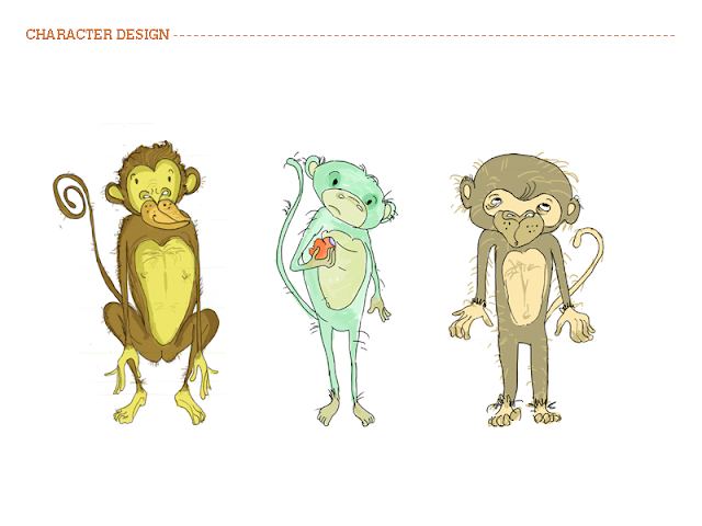
Design Development - Character Design

Here are some rough sketches and coloured iterations of the first draft of character designs for the storybook.


Concept Development - Meet The Characters

Here are the characters, the witnesses and marginalized species who reside in and around urban environments and are affected by the way cities distance themselves from biodiversity and move towards monocultures. Along with the personality and significance of the characters, the excerpts from the stories illustrates their role and perspective in this scenario :


Concept Development - The Stories

"Stop digging your nose in research. Start writing. Be silly"

That was some much needed advice that I received in the last seminar. Even though research and reading can go on forever, it needs to take a backseat now and the process of concept development has to begin.


Here are the ABC's of what the stories require:

The concept 
The storybook weaves together a narrative made up of the accounts of various species that have been witness to or marginalized by the depletion of biodiversity in and around urban environments.


The setting
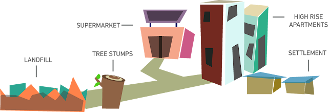
The stories are set in a landscape that spans across a peri-urban landfill, the farms that produce food for the city and the city itself. 


The Tone
The tales are from the perspective of the various animate and inanimate witnesses. They will try to evoke empathy and curiosity in subjects that are complex yet relevant to the lives of an urban audience. The tone will be casual, satirical and descriptive.